
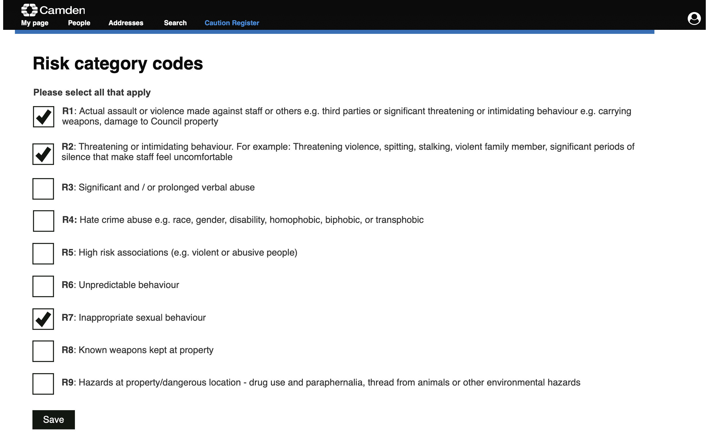
Overview
A council-wide system for staff safety
Camden Council staff regularly visit residents at home, meet them in offices, and handle sensitive cases across a range of services. When a resident has previously been violent, threatening, or posed a risk to staff, that information needs to be visible before contact happens.
Before this system existed, risk information was fragmented. Some services kept their own records, others had none, and staff could visit a resident without knowing another team had already raised a safety concern.
The Caution Register was designed to change that. It created a single council-wide system where safety-related incidents could be submitted, reviewed, approved, and acted on, with access controls ensuring sensitive information reached the right people without becoming visible to everyone.
context and complexity
A process with serious consequences at every stage
The Caution Register sat within a wider CRM ecosystem I was also designing, so both systems had to work consistently together and share information seamlessly.
The process itself was genuinely complex. An incident submitted by a manager had to be reviewed and approved by their Head of Service before it was formally entered into the register. Each role had a defined timeframe to complete their step, with alerts triggered if deadlines were missed. If a resident appealed a decision, a Director reviewed it, coordinating through their Personal Assistant.
Annual reviews were required for every active entry, raising questions about which incidents to consider and who should lead the review when multiple services were involved.
The map below shows the golden journey; multi-incident cases introduced further exception logic.

Simplified golden-journey map showing the main roles, decisions, status changes, and review points the system had to support. Multi-incident cases introduced further exception logic.
Each stage involved different roles, permissions, and information needs. A manager submitting an incident needed a different view from a Head of Service making a decision, or a Director reviewing an appeal. General staff visiting residents needed to know a caution existed and what it meant for their safety, without accessing the full details of what had happened.
The stakes were high at every point. Adding someone to the register incorrectly, failing to remove them when appropriate, or exposing sensitive information to the wrong people could create legal risk for the council and serious harm to the resident. The system had to support confident, consistent decision-making under conditions where mistakes had real consequences.
I worked closely with the BA throughout, combining her operational knowledge with my focus on user needs, information architecture, and workflow design. Between us we built the most complete end-to-end understanding of the process in the organisation, across its roles, exceptions, and governance points. That depth was what made it possible to spot gaps others had missed and make design decisions that reflected the real complexity rather than a simplified version of it.
my role
Sole designer on a complex, high-stakes system
I led all design work on the Caution Register, from workflow and interface design through to prototyping, testing, and working with the external developer before launch. This ran alongside my primary CRM project, so both systems had to be designed consistently and work together.
System and workflow design
—
Brought a user and design lens to the process mapping the BA led
—
Designed role-based journeys and permissions
—
Designed the decision, approval, and appeal screens
—
Tested journeys across managers, Heads of Service, Directors, and PAs
Quality and delivery
—
Established shared UI standards based on GDS before Camden had a design system
—
Worked directly with the external developer to meet UI standards
—
Completed UAT before launch
—
Took low-code platform training to fix UI issues directly and reduce dependency on costly developer time
design decisions
Five decisions that shaped the system
A search design that protects staff from false confidence
The most safety-critical decision I made was that staff should never search for someone directly within the Caution Register.
The register only holds people who have already been flagged, so a no-result there is ambiguous. It could mean no caution, or simply that the person had not been added, or that the search had failed, and it could too easily be read as "safe" when it was nothing of the kind. Searching the CRM instead, as the system of record for people and properties, meant a result could actually be trusted.
Centralising search in the CRM meant staff first had to identify the person or property record. Any active caution was then surfaced on that record, reducing the risk of treating a failed search as proof that no caution existed.
This was the decision I had to defend most often. Going via the CRM felt roundabout and less intuitive, and I agreed, it was not how I would have designed it given a free hand. But the cost of a false sense of safety was too high to trade for convenience. I held the line because the risk was a person's safety, not just a slower journey.
A task flow that made the process legible
The platform's default workflow progression was disorienting. It listed stages from bottom to top, with options to progress or regress, and required users to understand internal platform logic rather than simply knowing what to do next.
I replaced it with a task list pattern inspired by GDS, showing every stage in chronological order with a clear status: completed, pending, not started, or cannot start yet. The available action changed depending on the user's role. A manager saw the stages but no action on the Head of Service decision step. A Head of Service saw a Make decision button on that same step. The interface adapted to the user's role without requiring them to know the process in advance.

Reframing the workflow as a task list made sequence, status, and responsibility clear without requiring users to understand the platform’s internal progression logic.
Building accessibility in from the start
Without a Camden design system, the platform was defaulting to its own inconsistent, inaccessible standards. I built a design system based on GDS principles and handed it to the developer as the standard to build from, ensuring consistency across both the CRM and the Caution Register.
Accessibility in back-office systems was not treated as an organisational priority at the time. The assumption was that legal obligations applied to public-facing services, not internal tools. I disagreed. A staff member's disability does not become less relevant because they work for the council rather than access its services.
A governance-safe notes solution, designed from research
A proposal to include a general notes tab raised governance and FOI concerns. Unstructured notes added outside the formal process could create records that were hard to justify, or let inappropriate information influence decisions.
I had reservations about it, but I also knew I didn't yet understand every role's needs well enough to rule it out on my own. So rather than make the call unilaterally, I brought the question into user testing. The feedback was clear, a notes capability was needed, particularly for sensitive information that not everyone should see, but access clearly had to be controlled.
The solution was a restricted notes field, visible only to Heads of Service and Directors, kept separate from the general comments captured during the formal approval process.
Formal decision comments
Purpose
Decision record
Visible to
Relevant process roles
Used in
Approval workflow
Restricted notes
Purpose
Sensitive context
Visible to
Heads of Service and Directors only
Used for
Controlled access area
General notes
Decision
Not included
Visible to
-
Reason
Outside the controlled workflow
Notes were separated by purpose and visibility, rather than added as a general open tab.
the system
Complexity made navigable
The final system gave each role a clear view of what needed their attention, what stage each incident was at, and what action they were responsible for next.
Dashboard and queues: Each role could see the records and workflow queues relevant to their responsibilities.
Incident record context: Incident history, caution status, risk categories, and controls were brought together in one record view.
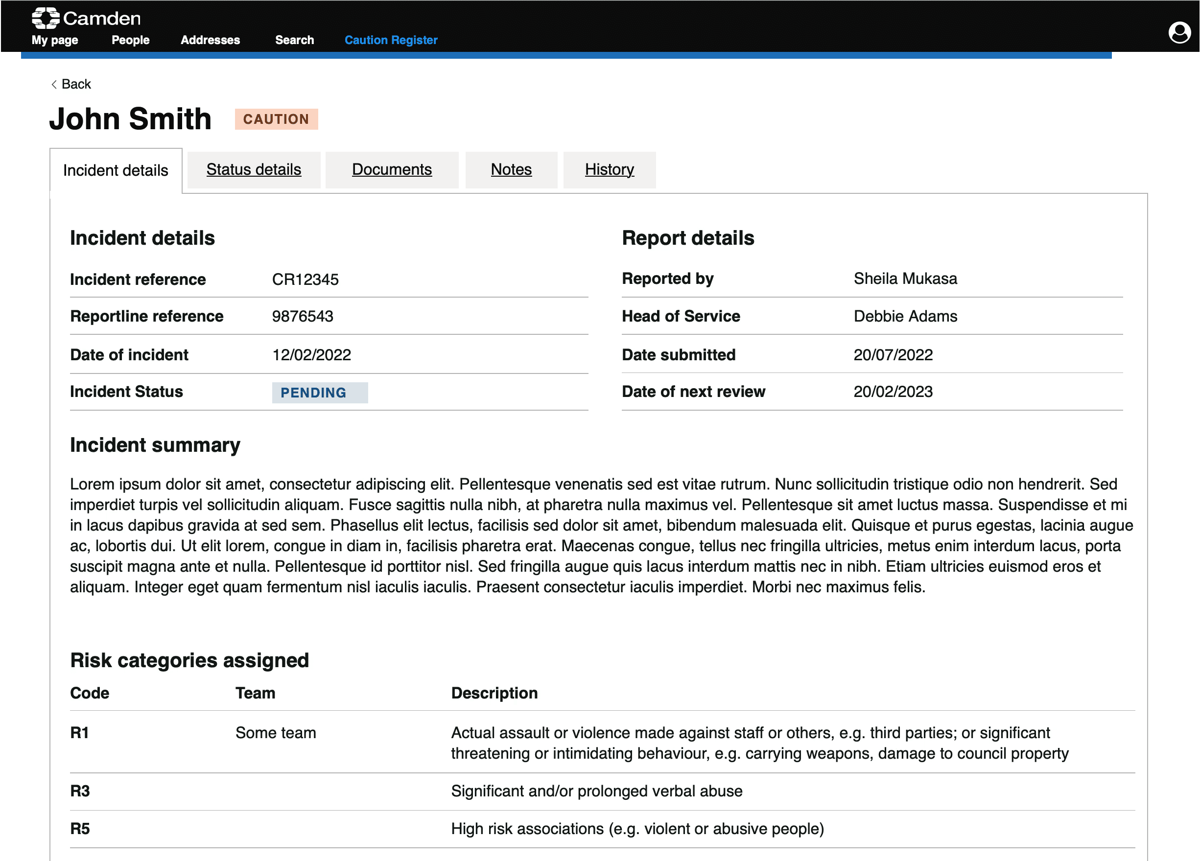

Incident details and status in context: Incident information and process status were kept separate but visible together, so decision-makers could understand both what happened and where the case sat in the workflow.
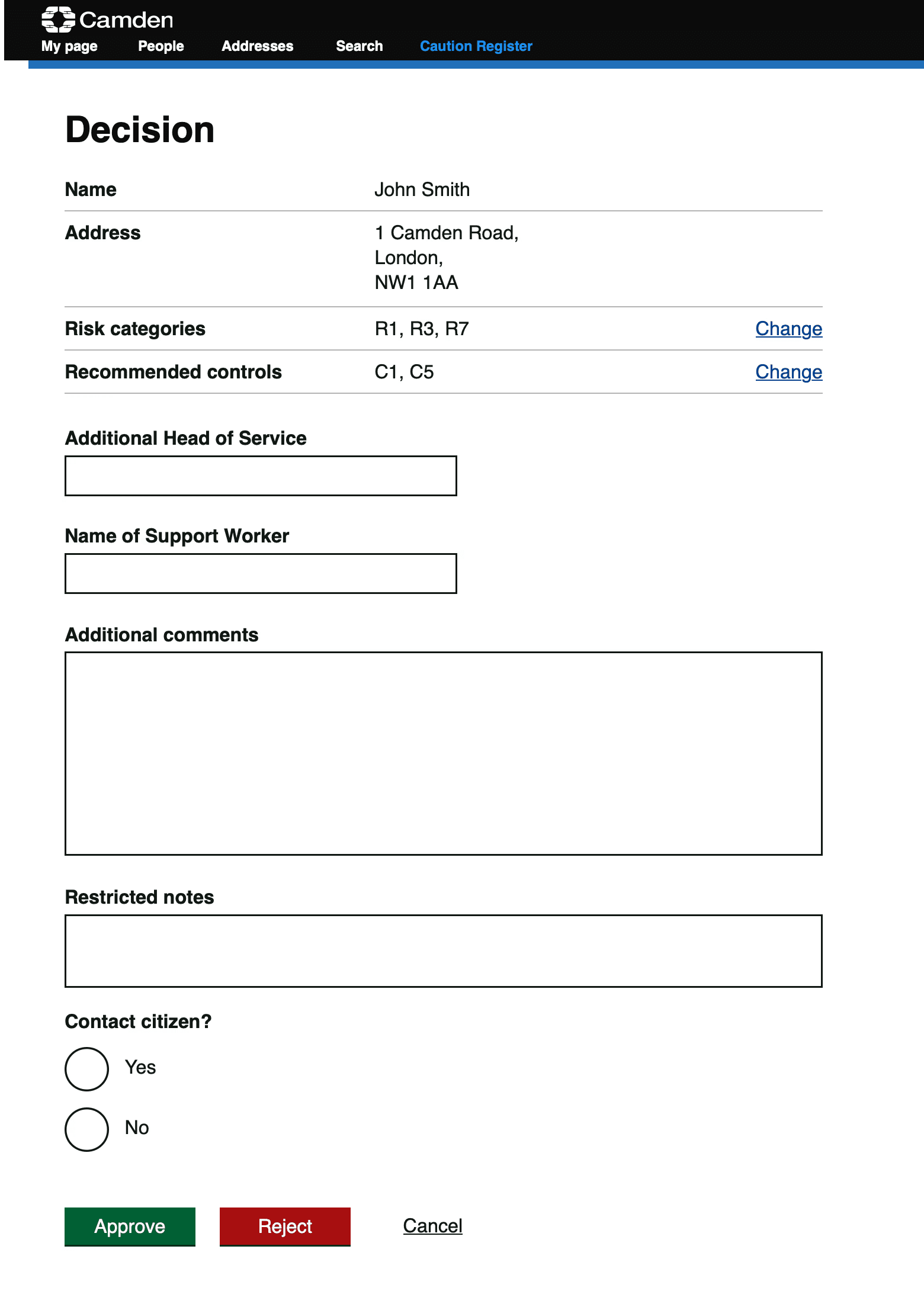
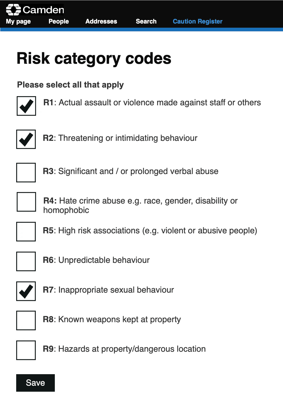
Decision pages: Heads of Service had the context needed to approve, reject, update risk controls, or record restricted notes in one controlled place.
the system
Complexity made navigable
The final system gave each role a clear view of what needed their attention, what stage each incident was at, and what action they were responsible for next.
Dashboard and queues: Each role could see the records and workflow queues relevant to their responsibilities.
Incident record context: Incident history, caution status, risk categories, and controls were brought together in one record view.
Incident details and status in context: Incident information and process status were kept separate but visible together, so decision-makers could understand both what happened and where the case sat in the workflow. The task flow showed where an incident was and who was responsible for the next step.
Decision pages: Decision-makers could review context, change risk codes/controls, add restricted notes, and approve/reject.
Validation
Testing redlected the real workflow
Because the process involved four roles with different permissions and responsibilities, I designed the research to mirror the real workflow rather than test it as a single linear journey.
[RESEARCH SETUP BLOCK, 2x2:]
8 participants Two per role, across managers, Heads of Service, Directors, and PAs
4 role-specific journeys Submit an incident, make an approval decision, coordinate an appeal, review a decision
Realistic conditions Pre-populated data and email notifications triggered live during sessions
Structured analysis Findings grouped by page, role, and theme, then prioritised using MoSCoW
[END BLOCK]
The sessions were conducted remotely, with the BA and me alternating between leading the interview and taking notes. Getting time from Directors took persistence, but having all four roles represented was essential for validating the full process rather than individual parts of it.
Testing confirmed that the core workflows were clear and navigable, while surfacing specific improvements before launch. Email notifications needed higher importance markers to avoid being missed in senior inboxes, some labels needed clarifying, and records needed to default to most recent first. These were addressed before go-live.
The notes question was deliberately brought into the sessions as an open question rather than a decision already made. The feedback directly shaped the restricted notes solution, showing research informing design rather than simply validating choices already made.
Impact
A system that works, and keeps working
Adopted beyond the first service
The register launched with the contact centre, Camden's largest team with regular face-to-face resident contact, before expanding to additional services.
Designed to extend
The annual review workflow, one of the most complex parts of the process, was implemented after I had handed the project over. The fact that it could be built from the existing design showed that the logic was clear, documented, and robust enough for others to extend.
Closed a staff safety gap
Before the register, a housing officer could visit a resident without knowing another service had flagged them as a risk. The system created one place to surface that information, accessible to everyone who needed it, with appropriate controls over who saw what.
That is not a UX improvement. It is a safety improvement.
"You have taken a very complicated process and made it very simple and straightforward. I look forward to seeing it go live."
-Head of Service, user testing
Reflection
What this project taught me
This was the most complex system I have designed. Not because of the interface, but because of what the interface had to hold: multiple roles, competing information needs, legal sensitivity, and a process where mistakes had real consequences for real people.
The most important work happened before any screen was designed. It was understanding the process deeply enough to spot the gaps, ask the questions others had not asked, and make design decisions grounded in how the system would actually be used rather than how it had been specified. That work does not show up in a prototype, but it shapes everything in it.
The goal was never to hide the complexity. It was to absorb it.
The complexity was real and it stayed real. The design work was deciding where that complexity should live. It belonged in the logic, the permissions, and the workflows, so that the people using the system did not have to carry it themselves. A Head of Service deciding whether someone belongs on a register that affects staff safety should be able to focus on that decision, not on navigating an interface.
View case study
View selected work
View selected work